a bold rebrand + digital experience for a gefencing pioneer
Bluedot built some of the most accurate geofencing technology in the world — a location engine trusted by brands for curbside pickup, loyalty programs, and seamless check-ins. But while the platform kept advancing, the brand hadn’t kept pace. Its identity felt technical and dated, speaking only to developers when the real growth opportunity was with marketers, product teams, and executives. Bluedot came to us for a brand transformation and web experience as smart and frictionless as its technology.
Bluedot needed a brand and narrative that matched the scale of what they had already built, and positioned them as the company defining the future of the category.
The future of place, explained now
VEGA Digital Awards Winner Owned Media
Most innovate companies rankings
Winner
Content &
Corporate
Identity:
Rebrand
The approach
Reframing a developer tool into an enterprise powerhouse
We began with deep brand strategy work to uncover what truly differentiated Bluedot. Their technology’s global accuracy, future-proof privacy and compliance, and ability to power seamless experiences across industries became the foundation of a new story. The opportunity wasn’t to simplify the technology, but to translate it — connecting technical rigor to real-world value for a much broader audience.
From those insights, we shaped a clear positioning around precision without compromise. This framing honored Bluedot’s credibility with developers while opening the door to marketers, product teams, and CX leaders who needed to understand how predictive location intelligence could drive better customer experiences. The strategy shifted perception from “an API for engineers” to a visionary enterprise partner enabling what comes next in location-based engagement. That strategic clarity guided everything that followed.
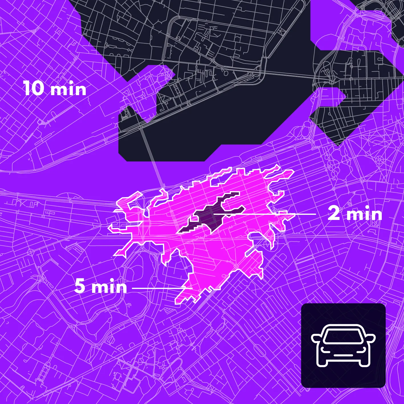
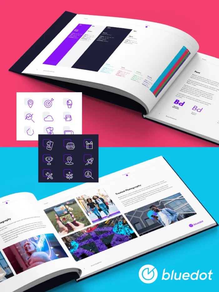
We reimagined Bluedot’s identity to behave like the technology itself: fast, precise, and in constant motion. Color, line, and form work together to show how place becomes signal and how movement turns into meaning. Electric palettes and dynamic systems bring charge to something normally invisible, giving the brand a visual language that feels active, directional, and built for what comes next.
That same momentum carries through the website, where clarity and performance were equally critical. The experience was designed to move people forward, translating complex, predictive technology into moments of understanding marketers and enterprise teams could actually use. Post-launch, the results reflected that shift: sessions increased, bounce dropped, time on site climbed significantly, and visitors explored more deeply across the experience. The site didn’t just express the brand — it sharpened engagement and strengthened enterprise conversations.
“SUCH AN EPIC EXPERIENCE. THE SITE IS GORGEOUS. THE BRAND NOW LOOKS AND FEELS AS GOOD AS WE KNOW OUR PRODUCT IS. WE TAKE FOR GRANTED NONE OF THE HARD WORK, LOVE, AND MASTERY OF CRAFT AND CARE IT TOOK TO GET US THIS FAR. HEARTFELT THANK YOU TO MALI.”
JUDY CHAN | FORMER VP MARKETING, BLUEDOT
TAUGHT LEADERSHIP > “THOUGHT LEADERSHIP”
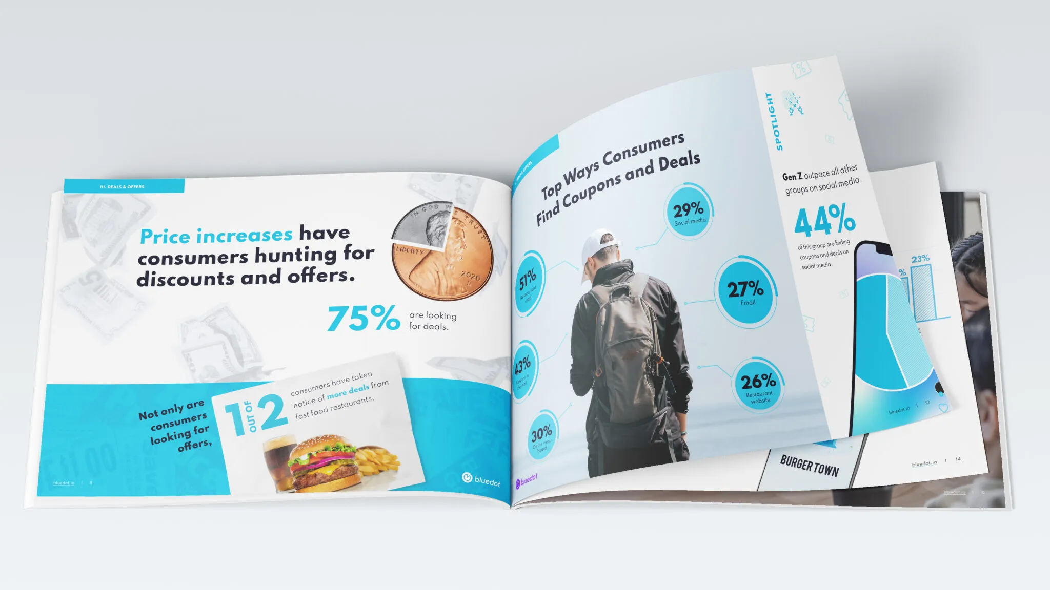
Beyond the brand and site, we helped Bluedot step into visible category leadership through original thought leadership. Together, we named and launched THE STATE OF WHAT FEEDS US, an editorial, data-driven series exploring how place, movement, and human behavior around food in the time of COVID and beyond intersect.
More than a report, the series positioned Bluedot as a true trend predictor, offering insights the industry hadn’t yet articulated. The multi-page experience and accompanying data visualizations earned multiple awards, reinforcing Bluedot’s authority and giving the brand a durable channel for shaping the conversation, not just participating in it.
A color. A shape. A category leader.
Bluedot’s new brand and site helped turn a powerful but under-recognized developer tool into an enterprise-ready growth engine, driving a 5× lift in qualified leads and earning Fast Company’s #1 Most Innovative Company honor, alongside 4 major design and content awards, including a Silver International Design Award. More importantly, the work gave visible form to technology that had been quietly shaping what comes next for years. It didn’t invent Bluedot’s leadership. It made it easier to see, understand, and believe in.
Once the market could recognize it, momentum arrived. Right on time.